Brand guidelines
The idea
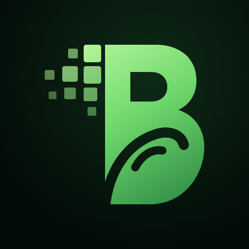
A bold, living-green B. On its left, the letter breaks into pixels — raw digital ideas assembling into form. In its lower bowl, a wave sweeps upward like a growing leaf: the brainwave, and the growth it creates. Digital precision meets organic momentum. Our line: Ideas | Solutions | Real impact.
Logo


Downloads: full logo (light bg) · full logo (dark bg) · mark SVG · stacked logo (dark bg) · app icon PNG 512. Keep clear space equal to the height of the "B" counter around the logo; never recolour, stretch or add effects. Minimum size: mark 20px, full logo 110px wide.
Colour
Deep Canopy#2E8A45
Brainwave Green#4CC35A
Spark Lime#A8F290
Signal Amber (status only)#FFB547
Midnight Forest#030C08
Mist#F5F8F5
Brainwave gradientdeep → green → lime
Midnight Forest is our home ground; the green gradient is reserved for the mark, primary actions and moments of emphasis. Amber is only used to signal status (e.g. "in build").
Typography
Michroma for the wordmark and taglines — wide, engineered, unmistakable. Montserrat for "SOLUTIONS LTD" in the logo. Space Grotesk for headlines — technical, confident, a little human. Inter for body text and interfaces — clear at every size. Both are open-source and self-hosted.
Voice
Plain, confident and specific. We say what a product does and for whom, label what is live versus in build, and never overclaim. Short sentences; British English.